
“[The S-Line is] primarily an economic development engine and secondarily, a transportation mode.”
University of Utah Professor Reid Ewing for the Salt Lake Tribune
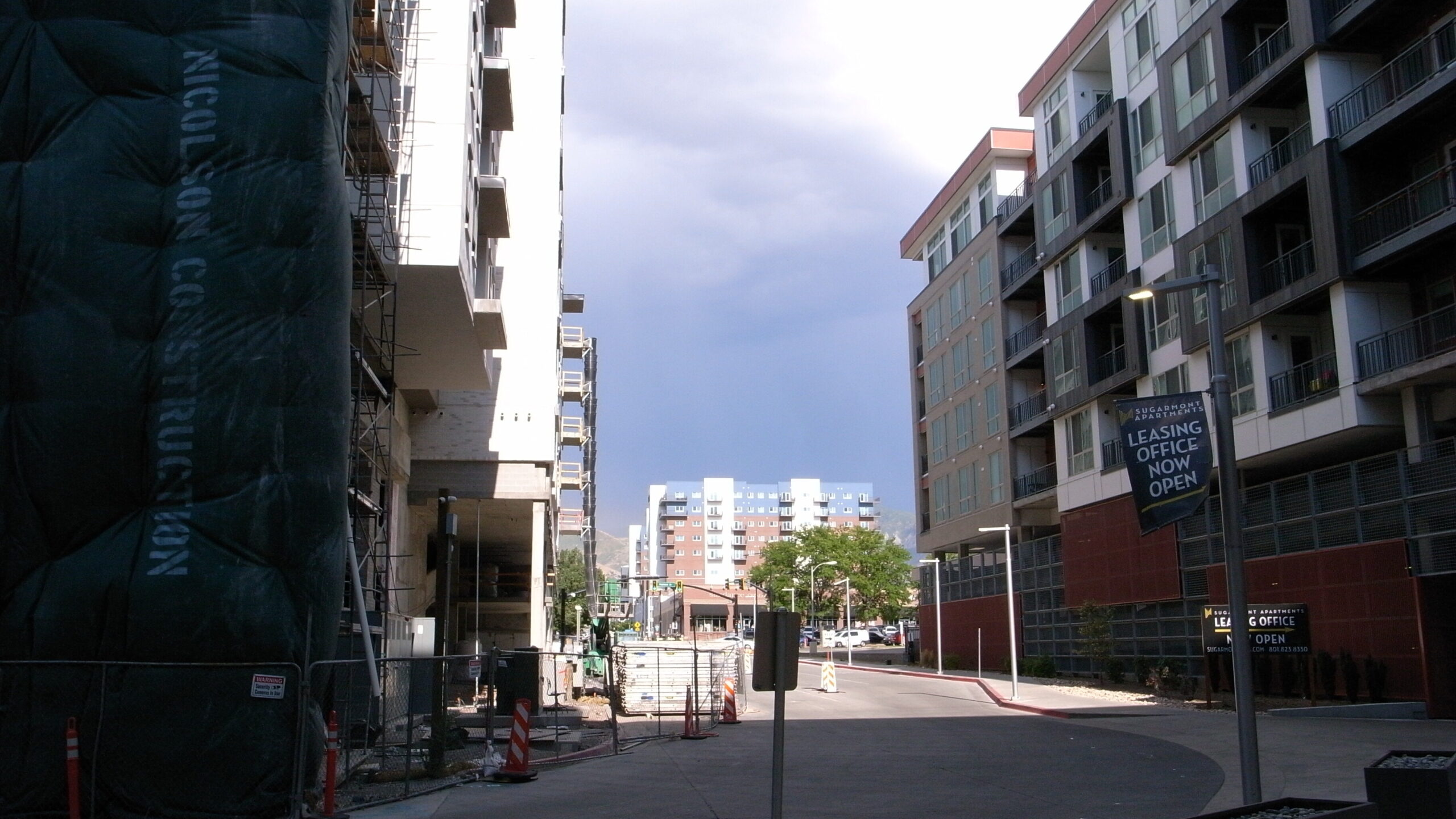
Trains are cool and streetcars are no exception. Walking along Parleys trail is absolutely lovely and seeing the S-Line glide by is pure bliss. But the S-Line wasn’t built for me or anyone else to actually use, it was built for capital. A recent Salt Lake Tribune article explored a study which found that the S-Line spurred up to $2 billion in economic growth through increasing property values and inducing new construction along the rail corridor. This was not surprising to hear, and this blog has previously explored how the existing transit-oriented development along the S-Line orients itself to the same classes as gentrification, but with increased scrutiny on the S-Line and its impacts, this article returns to it and will be taking a look at the impacts its creation had on the neighborhoods its corridor is built through. Using census data from the American Community Survey, this post will explore how the census tracts the S-Line was built through changed between 2012, before the S-Line was built, and 2021.
The bottom line is things got more expensive (those elevated property values mentioned earlier). Between 2012 and 2021, across all census tracts in Salt Lake County, rent increased by an average of 36%. Along the S-Line, however, rents rose an average of 46%, with individual tracts increasing as much as 64%. Across the county, home values increased by an average of 50%, while along the S-Line they increased an average of 65%, with individual tracts seeing over 70% increases.
But let’s dive into it a little more and see how these changes and others were felt across the S-Line corridor.
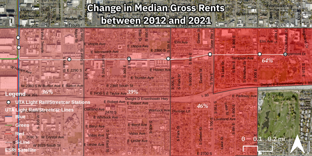
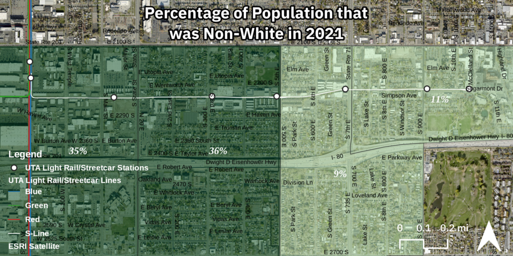
The S-Line travels from Central Point Station in South Salt Lake to just outside the heart of Sugar House at Fairmont Station. Common knowledge recognizes that Sugar House is a wealthy neighborhood, so it won’t come as a surprise to anyone that the largest increase in rent occurred there, in the tract that captures the eastern end of the S-Line. This finding is supported by this blog’s previous work on specific TOD projects along the S-Line which also found the highest rents on available units being charged by new developments in the vicinity of the eastern terminus of the S-Line at apartment complexes like Dixon Place, Sugarmont, and the recently deconstructed Sugar Alley. The western end of the S-Line has, so far, seen less development than the eastern end despite extensive rezoning and South Salt Lake’s hopes of a new, denser, downtown district. This lack of development activity is reflected in relatively lower increases in rent, which closely reflect the county wide average rent increase. Furthermore, the east-west split captures the larger valley wide trend of wealth and capital being concentrated on the east side while the west side houses the more diverse working classes. The appearance of this trend in this particular geography is unsurprising since South Salt Lake, sitting on the west end of the S-Line, is itself more diverse than Salt Lake City’s east side neighborhoods like Sugar House. To put more concrete numbers to this observation, by 2021, the two western census tracts that the S-Line cuts through were over 3x more diverse (35.2% and 35.7% people of color) than the two eastern census tracts (9.2% and 10.8%).
Demographic changes along the S-Line, however, are less revealing of general trends. The total population of the census tracts along the S-Line grew by only 5% between 2012 and 2021, and both the white-only and Latino populations dropped slightly in absolute terms. The largest racial change observed was a nearly 30% increase in the people of color population in the area as a whole, almost half of which was driven by an increase in the Asian population.
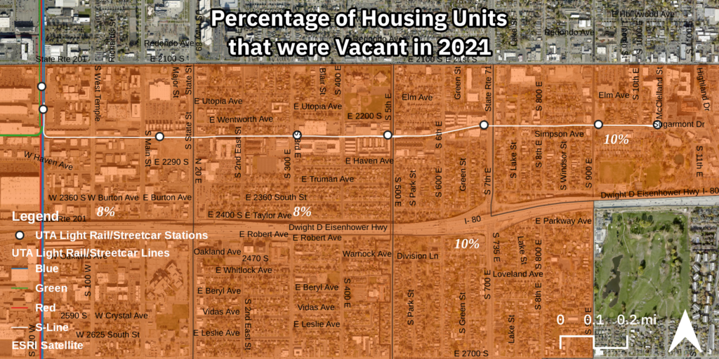
While changes in racial composition are interesting and necessary to explore, the most telling changes occurred in housing. Changes in the housing landscape reveal a modest increase in total housing units and a massive increase in vacancy rates. While the total number of housing units increased by 26% from 5,812 to 7,345, the number of those units which were vacant more than double from 313 in 2012 to 650 in 2021. Of the 650 vacant units, 60% of them are currently on the market to be either rented or sold.
At the prices that these units are asking for, it begs the question, how much luxury housing can be built before that market it saturated? And what happens then? With such high vacancy rates in such expensive housing, standard YIMBY logic would hold that this luxury housing will begin to trickle down to more affordable markets in some form, but shouldn’t this have already happened? Instead, what appears to be the case is that the landlords and property owners will simply keep these units on the market till someone can afford it at the unaffordable price they’re asking, that is to say that they’d rather wait until a wealthy tenant moves in, than lower the asking price to allow for working class tenants. The fact that YIMBY’s in Salt Lake would continue to believe that simply building more could ever solve the housing crisis when, in the already existing TOD along a streetcar corridor, there exists an 8.9% average vacancy rate (this climbs to over 9.5% in Sugar House), shows that they are more interested in supporting land-owning capitalists than finding real solutions. To put this vacancy rate into perspective, many local and state governments in the US require just 5% vacancy to justify rent controls being put into place. With a massive increase in TOD in the Salt Lake valley just around the corner, set to deepen the valley’s affordable housing crisis while ballooning profits for developers and landowners, one can only hope that the need for rent control and other real solutions to our ongoing housing crisis will become impossible to ignore.
Another telling statistic is found in the change in the percentage of renters who are burdened by housing costs (that is, spend more than 30% of their income on rent, utilities, etc.). While the total number of rent-burdened renters along all the tracts the S-Line crosses increased between 2012 to 2021 by 20%, as a share of total renters, this marks a decreased from 47% of the total to 41%. This drop in the percentage of all renters who are rent-burdened, in a timescale that saw rents skyrocket, could suggest an influx of higher-income renters able to afford the higher rents without being burdened by them, with the concurrent rise in the number of rent burdened renters representing existing residents who are now spending more on rent. This trend is reflected at the tract level in downtown Sugar House, where there was an increase in the number of renters who were burdened by housing costs between 2012 and 2021, but they decreased as a percentage of total renters. This suggests that the increase in renters was not spread evenly across all groups of renters (low-income, mid-income, high-income). Even if all income-tiers grew, high-income tiers grew (understood here as renters unburdened by housing costs) disproportionately more than the others in some of the tracts.
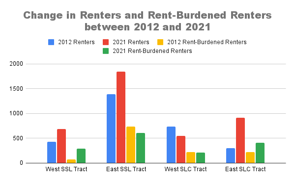
Drilling down to the tract level shows that the changes felt by the economic development along the S-Line were not felt consistently. Instead, they are rather concentrated in certain tracts, namely the easternmost tract still within South Salt Lake and the easternmost tract within Salt Lake City, the one that captures downtown Sugar House. What both of these two tracts show is a large increase in the number of renters, the majority of whom are unburdened by rents. Where these tracts diverge is that where Sugar House also sees an increase in rent-burdened renters, in South Salt Lake, the number of rent-burdened renters decreases, not just as a proportion of renters but in absolute terms, at the same time that there are over 200 new renters added to the tract. From this, we can conclude that an influx of high-income renters drove the growth in renters in this tract.
These tract level trends begin to make more sense once a map of the new TOD developments along the S-Line is overlaid. These two tracts, which saw the largest increase in both renters and high-income renters, hold 7 of the 9 TOD projects this blog previously explored. This blog has previously claimed that “TOD has become just another tool for capital to wield in its endless search for more and more profit, for wealthier and wealthier markets,” this seemed to be more true than I knew when I first wrote that. TOD driven by the S-Line has shot rents to new unaffordable highs and brought in new upper-income renters who can afford it, most likely pushing out those who could not. And when these wealthier renters are not available, instead of lower the asking price to something that the hundreds of thousands of cost burdened renters in the Salt Lake valley could afford, landlords instead keep them vacant, demanding that they rent for the absolute maximum possible.
Whether these trends condemn the TOD along the S-Line to be an instance of gentrification is yet another question. If gentrification is the change from a working-class neighborhood into an upper-class one via the displacement of the working-class, what do we call the process by which an already unaffordable neighborhood becomes even less affordable? It seems that “gentrification” is simply another way of saying “economic development in working class neighborhoods,” but the larger project of urban capital accumulation is more than just this. The capitalist city is driven to grow and always produce more capital for the ruling classes, not just in working class neighborhoods through gentrification, but in upper class centers like Sugar House as well. It seems that as these centers become saturated with capital, the creep of gentrification begins, following light rail and streetcar lines out into the working class hinterlands, further subsuming them and bringing them closer into the fold of the capitalist city. But this theory requires more study.
This exploration is deeper than my last, but is still only scratching the surface of what we must know in order to adequately confront capitalist urbanism. While this has mostly served to back up already existing notions about who Sugar House was made for and who gets to live in the new market rate (read luxury) developments going up all across the valley, more nuanced and accurate understandings beg to be developed. And even more than this, the bridge from theory and understanding to action and change must be built as well. How does this analysis help build a movement against the capitalist city and the vacant luxury it continues to construct?
This exploration has also been a trial run in exploring this use of census data. This work will be reproducing to study changes along North Temple Boulevard, where the expansion of the Green Line TRAX to the airport, and the subsequent rezoning of the neighborhoods bordering North Temple, has brought new opportunities for capital accumulation to developers and landowners, and gentrification and displacement to long-time residents.